The name
Bolton.
One word. Never “Bolton Estates” in brand work. Mentor, Ohio goes in addresses and in the Mentor lockup.


Who this book is for, how it is set up, and where to get the files.
Designers, writers, printers, sign makers, and anyone making something with the Bolton name.
At a Glance, The Promise, The Foundation, The Landmarks, The Identity and In the World, in that order.
Fonts are free on Google Fonts. Always place logos from the master files.

The essentials of the brand: what Bolton is, the logo, and how it differs from other developments.
The name, logo, promise, story, colors and fonts, side by side.
One word. Never “Bolton Estates” in brand work. Mentor, Ohio goes in addresses and in the Mentor lockup.

The line the whole brand rolls up to. Live Well means daily life here is better: the woods, the trails, the house and the neighbors, all within a walk.
For a hundred years, the families who built Cleveland came here to live well. Now it is yours.
Moss and Honey lead. Six support them, each at its exact value.
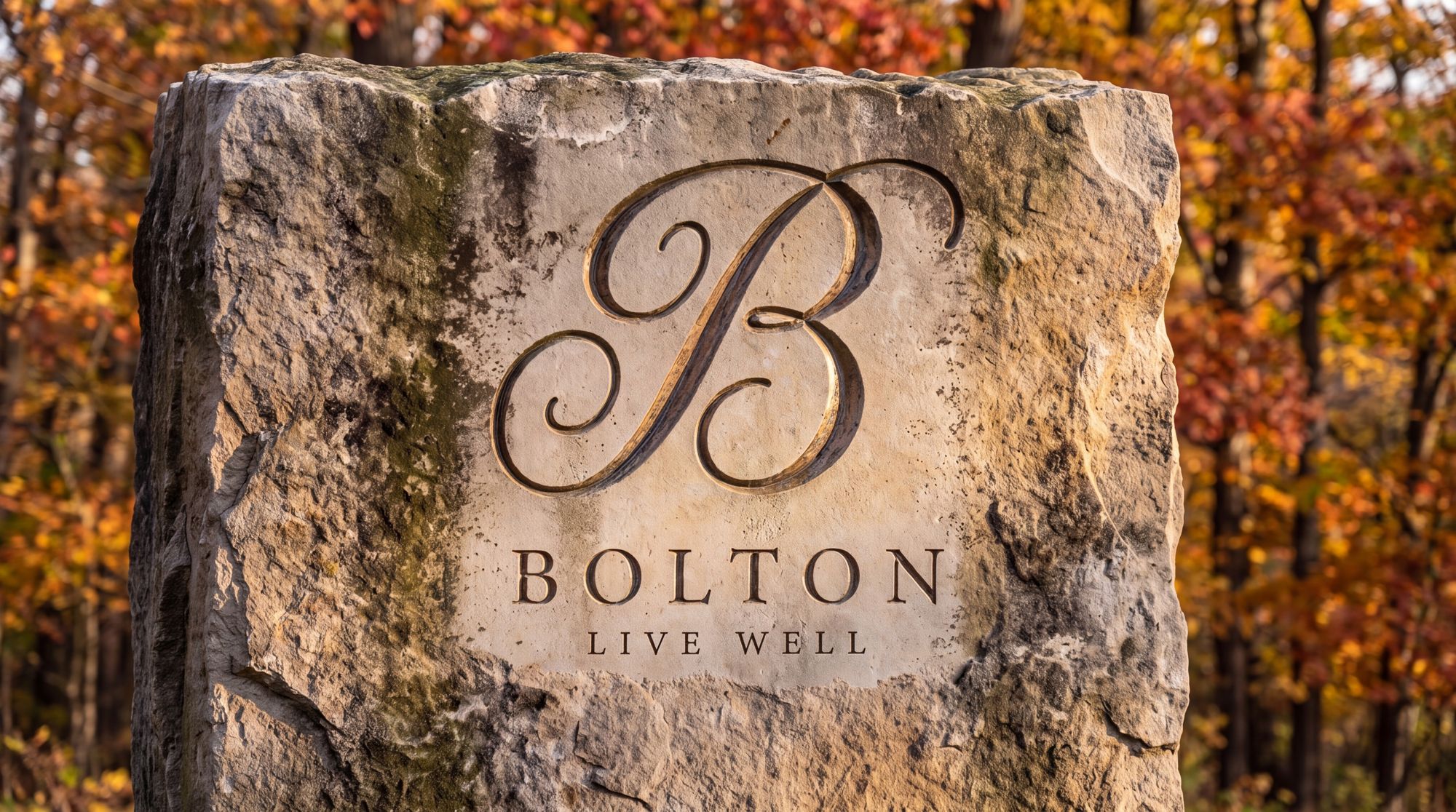
The B, the Bolton wordmark and the Live Well line together. Use this version first, whenever there is room.
One color, on a clear ground. Never rebuild it. Place it from the master file.
The longer bar in each row shows where Bolton goes further than a typical development.
Live Well: what Bolton promises, why it is true, and how the place is organized to deliver it.
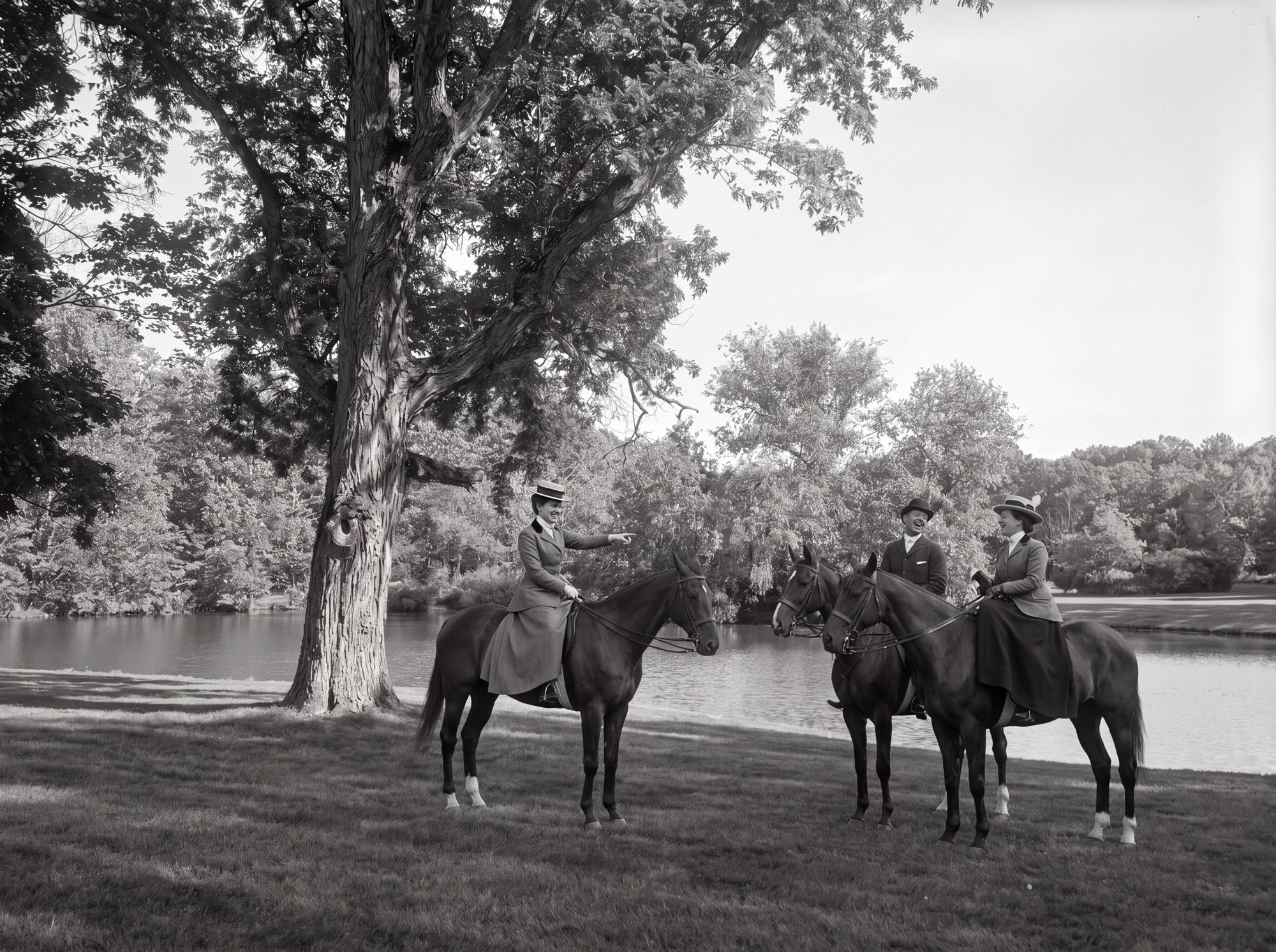
For a hundred years, the families who built Cleveland came here to live well.
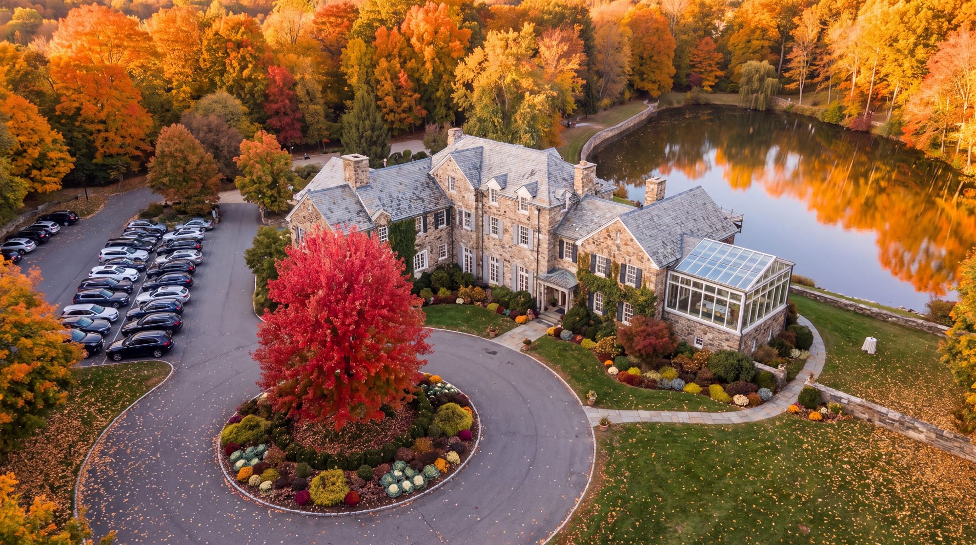
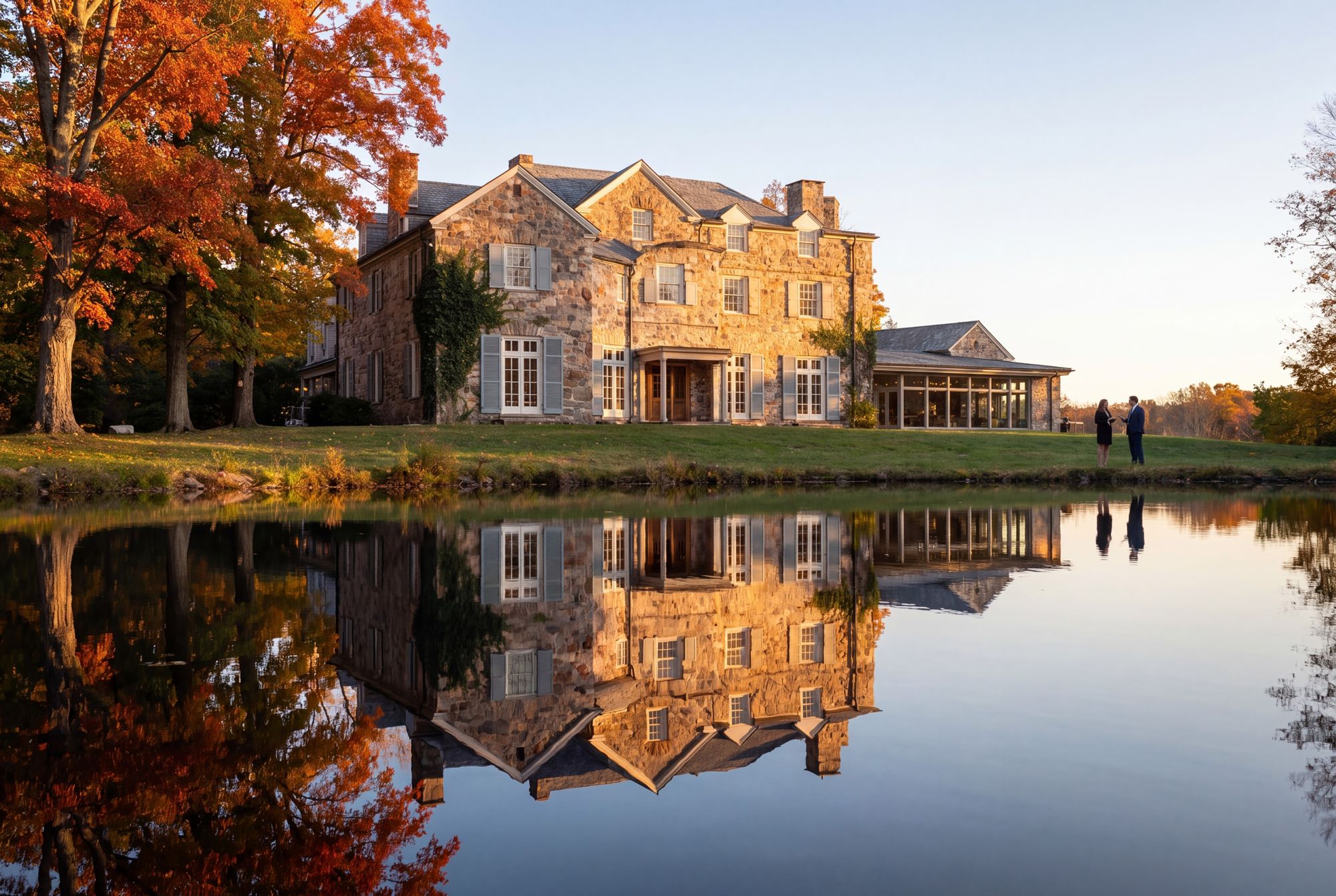
The Bolton family’s country estate in Mentor, Ohio, with the manor at its heart.
240 acres of woods, creek and fields, 90 of them conserved.
The estate opens as a neighborhood, with the manor and the woods at its center.
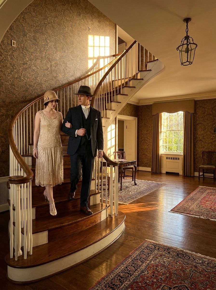
The three facts from the public record that the brand is built on.
The Boltons helped build Cleveland, and Frances Payne Bolton was the first woman Ohio sent to Congress.
David Z. Norton, the Boltons’ neighbor and brother-in-law, ran Rockefeller’s iron-ore business.
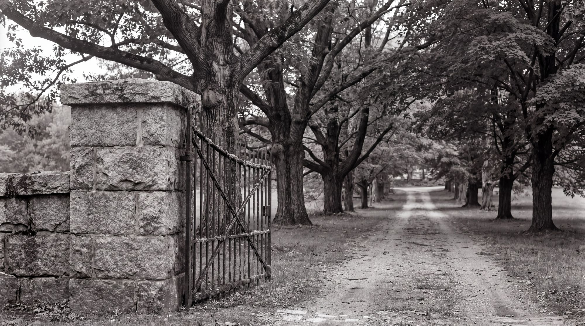
The oldest house on the estate is taken down with care, and its stone and doors are reused in the new entrances.
Live Well is Bolton’s promise: everyday benefits people can feel across the property. Each “well” names one; Feel Well is what they add up to.
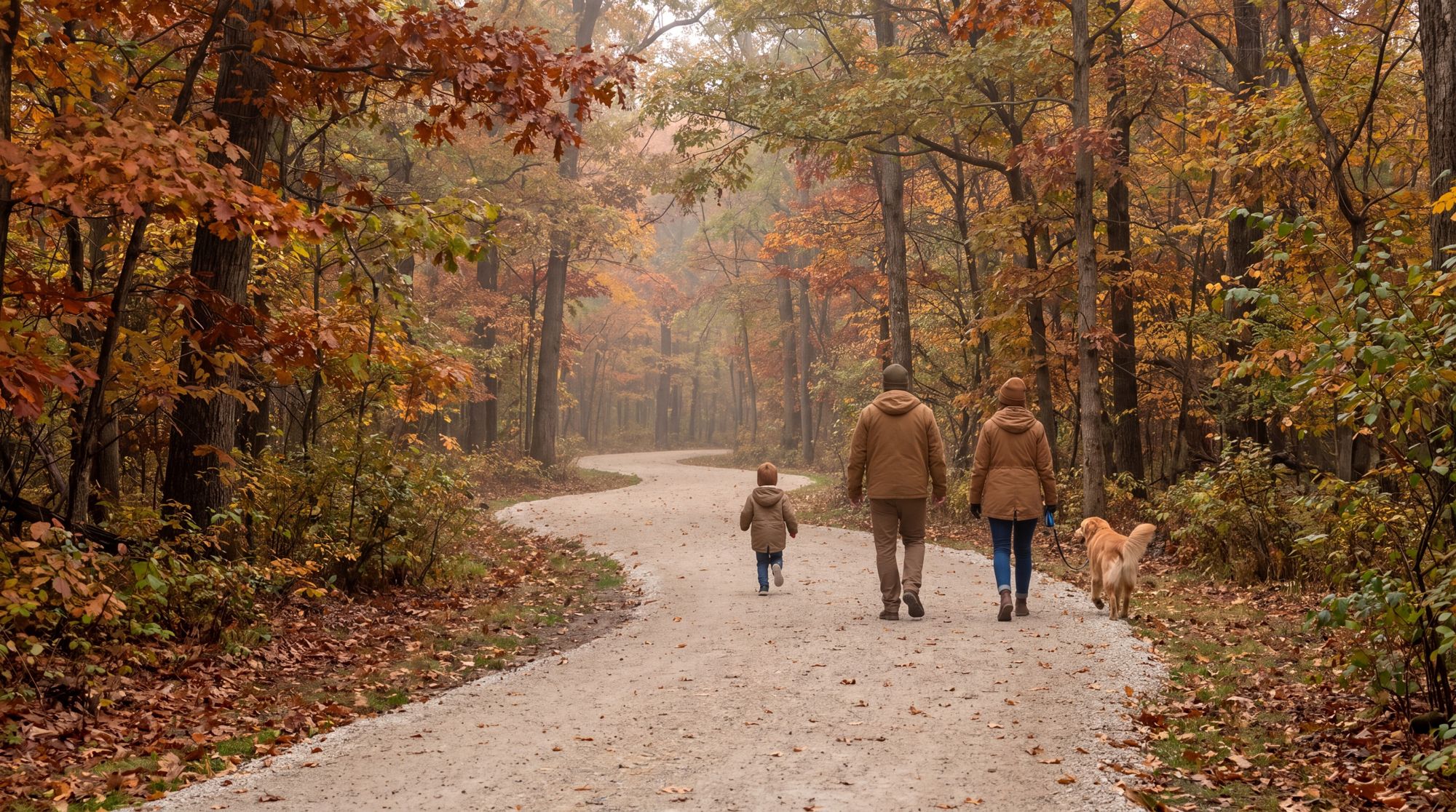
Live Well is the core line. Each line below has a job; use the one that fits the piece.
Under the logo, and at the end of everything.
A Life Well Built · Build Live Well · Live Well Mentor
A line can take a place: Come Live Well at the Manor.
Bolton is a hundred-year-old estate in Mentor, Ohio, brought back as a neighborhood where daily life is built around the land: the woods, the trails, the historic house and the neighbors, all within a walk. For a hundred years, this was where the people who built Cleveland came to live well. Now it is yours.
Bolton is the brand over everything. Live Well is the promise every place keeps. Each place below is where people experience it.


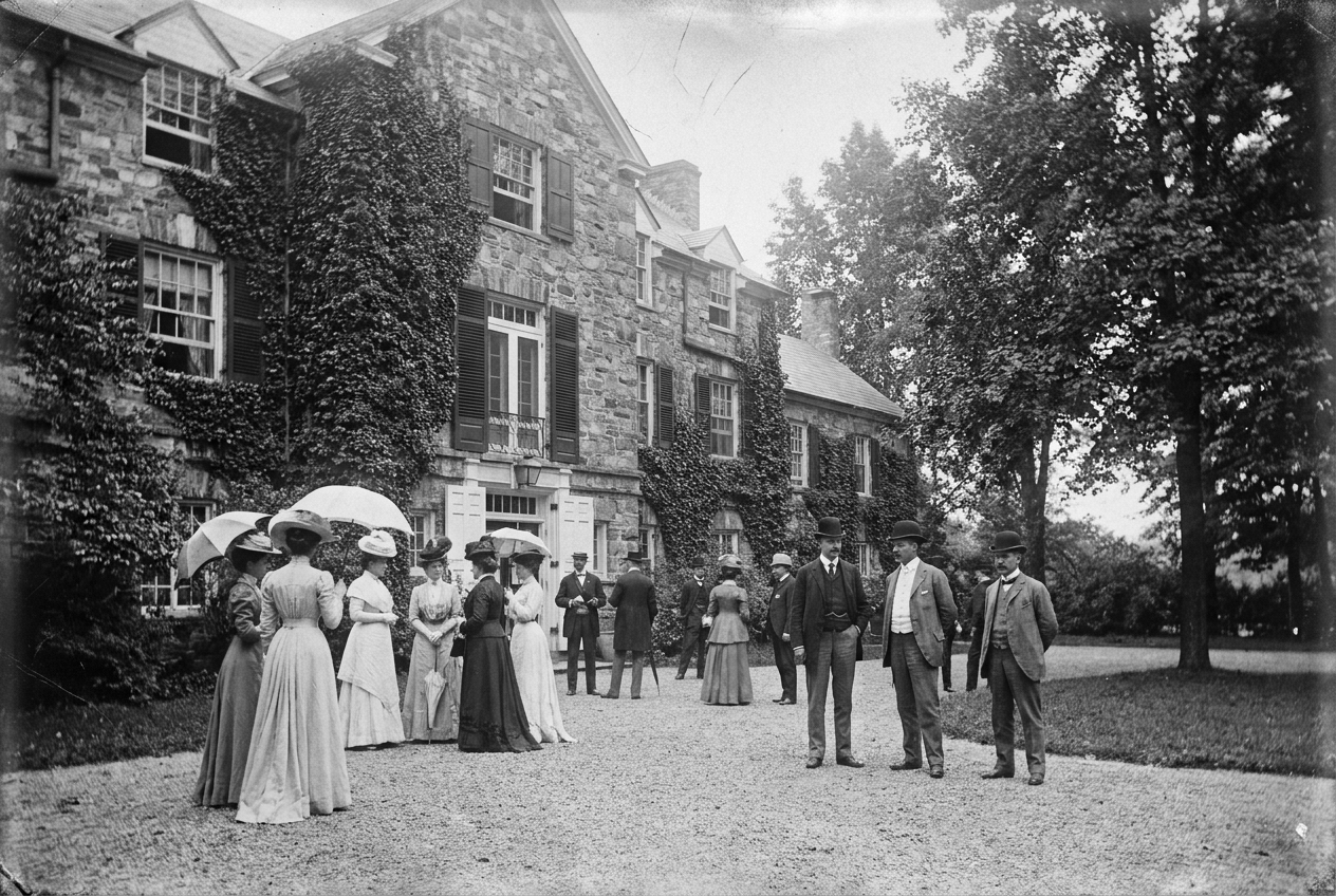
A hundred years on, and now it is yours.
Why Bolton exists, what it stands for, who it is for, and how it speaks.
Why Bolton exists, what it is aiming for, and the four things it does every day.
As a place to live well, with its land and history kept for the people here.
A neighborhood where the shops, the trails, the woods and home are all a short walk apart.
Every decision answers to these four.
The forest and the history, conserved before a street was drawn.
A living story people can step into.
The café, the trail, the spa, the table, all close.
As it grows, every part still belongs to the same story.
The six commitments behind every decision at Bolton. When a choice is hard, check it against these.
We protect what can’t be rebuilt: the forest, the house, the record. Conservation came before the first street was drawn.
We build on the estate’s real past. A hundred-year story, opened up and carried forward.
A place people are part of. You don’t need a deed to belong here.
Made right, so it lasts and appreciates: real materials, salvaged stone, nothing built to merely sell.
Daily life, done here, is simply better. Live Well is the measure every decision has to meet.
We say the real thing and let it land. Understated, never loud, and never “luxury.”
The five kinds of people Bolton is built for, and what each is looking for. Some are settled and ready to stay; some are still reaching for the life they want.

Sold the big house; wants to stay near family and the life they built.
Reaching for: legacy & ease, among their own.
Fear: losing relevance; leaving home.
Hooks: Heritage · Nature · Distinction

Doing well, with kids; done with the soulless subdivision.
Reaching for: a better life for the kids, with roots.
Fear: raising them somewhere with no soul.
Hooks: Quality of Life · Nature

First real place; wants it to mean something.
Reaching for: getting in early on something real.
Fear: settling for generic.
Hooks: Quality of Life · Belonging

Left for the career, now coming home.
Reaching for: a life they didn’t think Ohio offered.
Fear: having to leave again to live well.
Hooks: Quality of Life · Distinction

Established and independent; wants low-maintenance and people around.
Reaching for: easy, safe, social belonging.
Fear: isolation.
Hooks: Quality of Life · Heritage
Every buyer needs the basics, and every developer offers them. Our audience already has them. Bolton competes on what sits above the line: belonging, living well, and leaving something behind.
If Bolton were a person, it would be the Steward, a mix of three archetypes. Use them to set how Bolton behaves in any piece.
Legacy, standards, quiet authority.
Authority earned over a hundred years.
Truth and real knowledge.
Only what is real. We let the facts be impressive.
Nature, the wild, the authentic.
Old-growth forest and trails out your door.
The words we use, the words we avoid, and where Bolton sits between formal and casual. Write plainly, be specific, and show what is true.
luxury · resort-style · world-class · nestled · oasis · indulge
elevated · exclusive · live well · belong · roots · real · rare · steward · legacy
“Elevate your lifestyle” may be used, but never as the lead line.
Six messages that are true of Bolton and backed by the record. Lead with the one that fits the person and the moment.
Daily surroundings and habits shape how long and how well people live.
As retail fades, people now leave home for community and experience.
Bolton inherited a documented hundred-year legacy. Heritage is the one thing a competitor cannot copy.
The forest was protected before a single street was drawn, and it will never be for sale.
Finite, conserved, and built for people who stay.
Real materials and salvaged stone. A thing done right appreciates; conserved land compounds.
The ten places that make up Bolton, from the manor to the trails. Each has its own page: what it is, and how people use it.

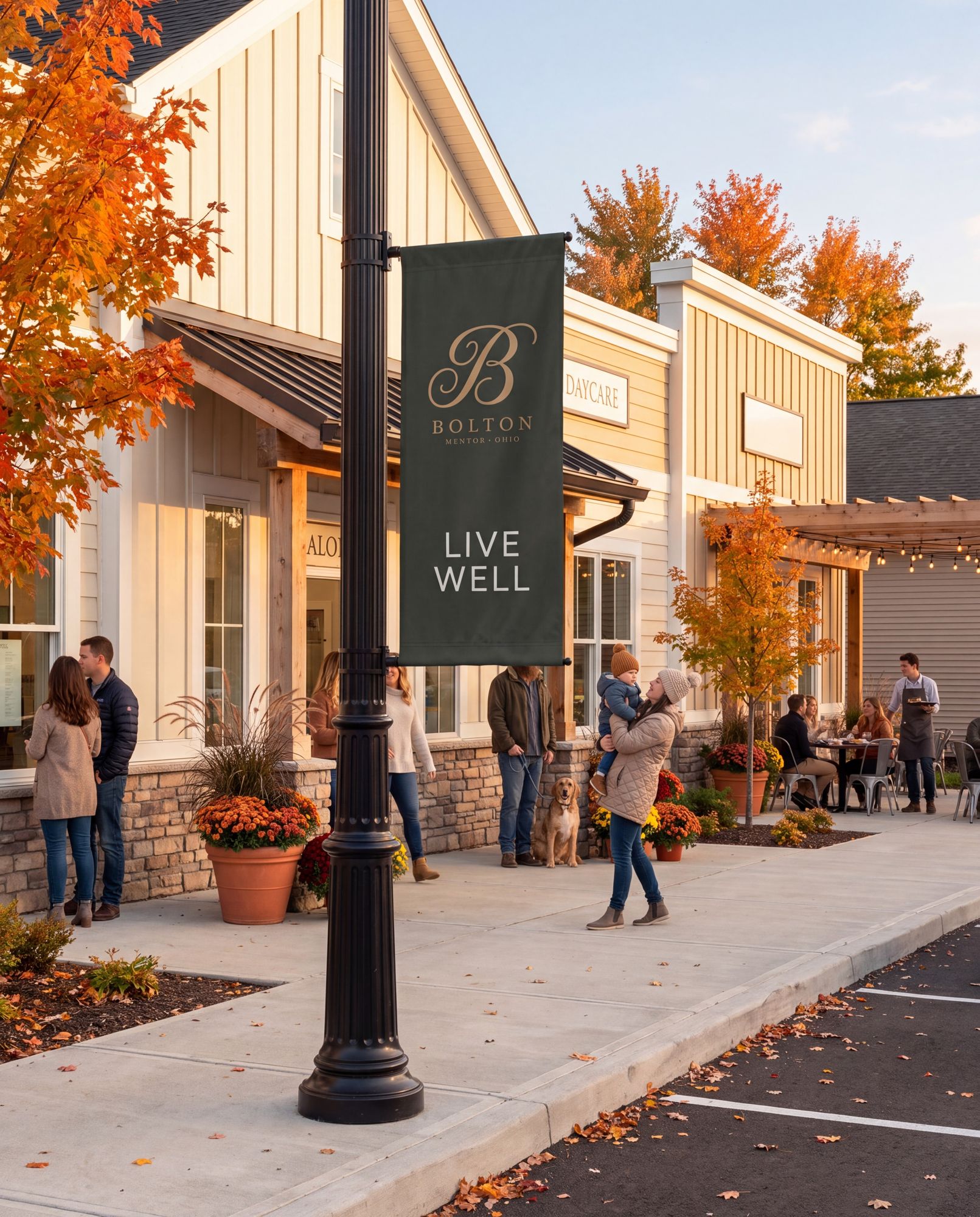
The everyday things a neighborhood needs: the café, the market, the salon, the daycare, within a walk of the homes around them. Small by design, and sized for the people who live here.
Gather Well · Feel Well: everyday errands that feel like part of home.
Nails before the wedding, the Saturday market, coffee after the loop: the week has places it always goes.
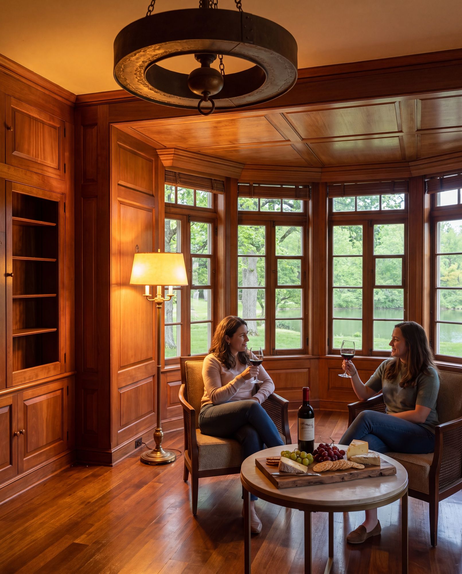
A working winery: stone, barrels and long tables.
Eat Well · Gather Well: the estate’s table, and its biggest stage.
A tasting on an ordinary Tuesday, a wedding on the terrace, the Visitor’s first taste of Bolton.
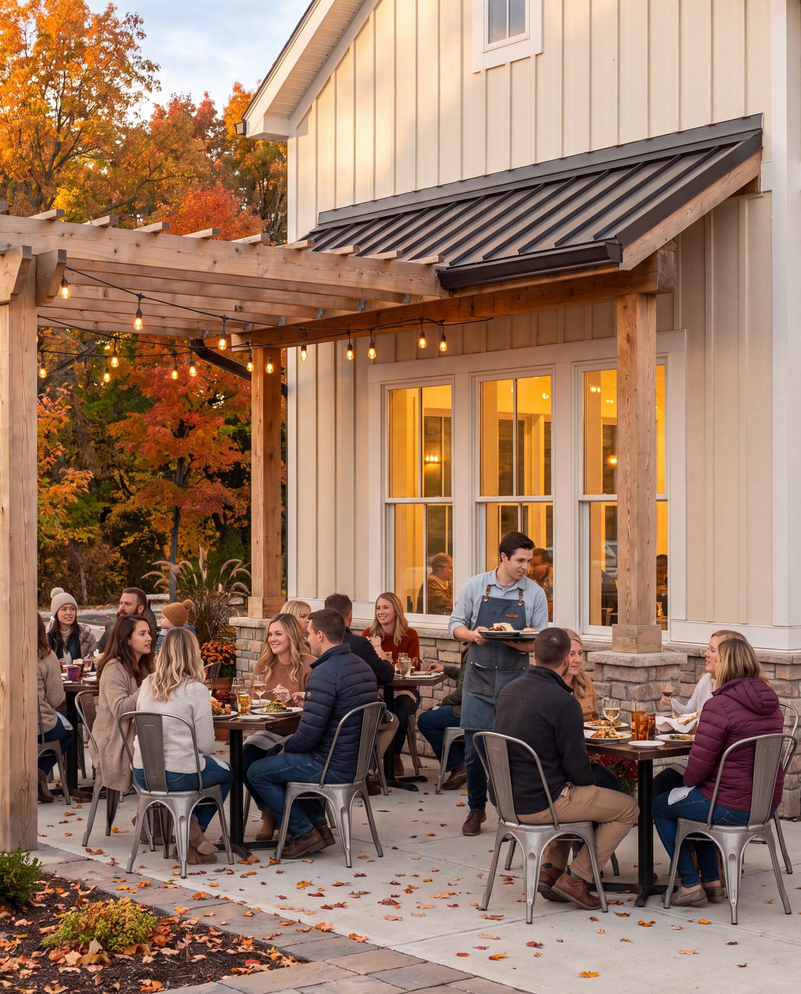
A restaurant on the estate: local food, simply made, open into the evening.
Eat Well · Gather Well: daily life’s best hour.
Dinner you can walk to, and walk home from.
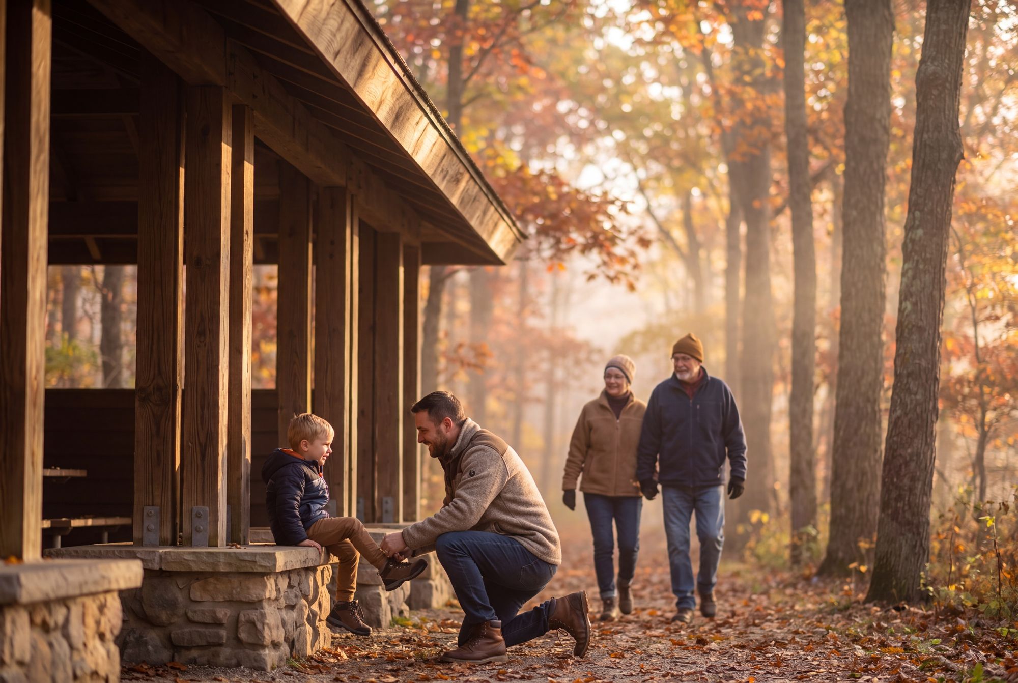
Ninety acres of conserved woods and trail, held in perpetuity and open to all of Mentor from the public trailhead.
Move Well · Nature as the Structure: the woods, walkable, and protected.
Out your door and onto the loop: the morning walk, the dog, the season changing week by week.
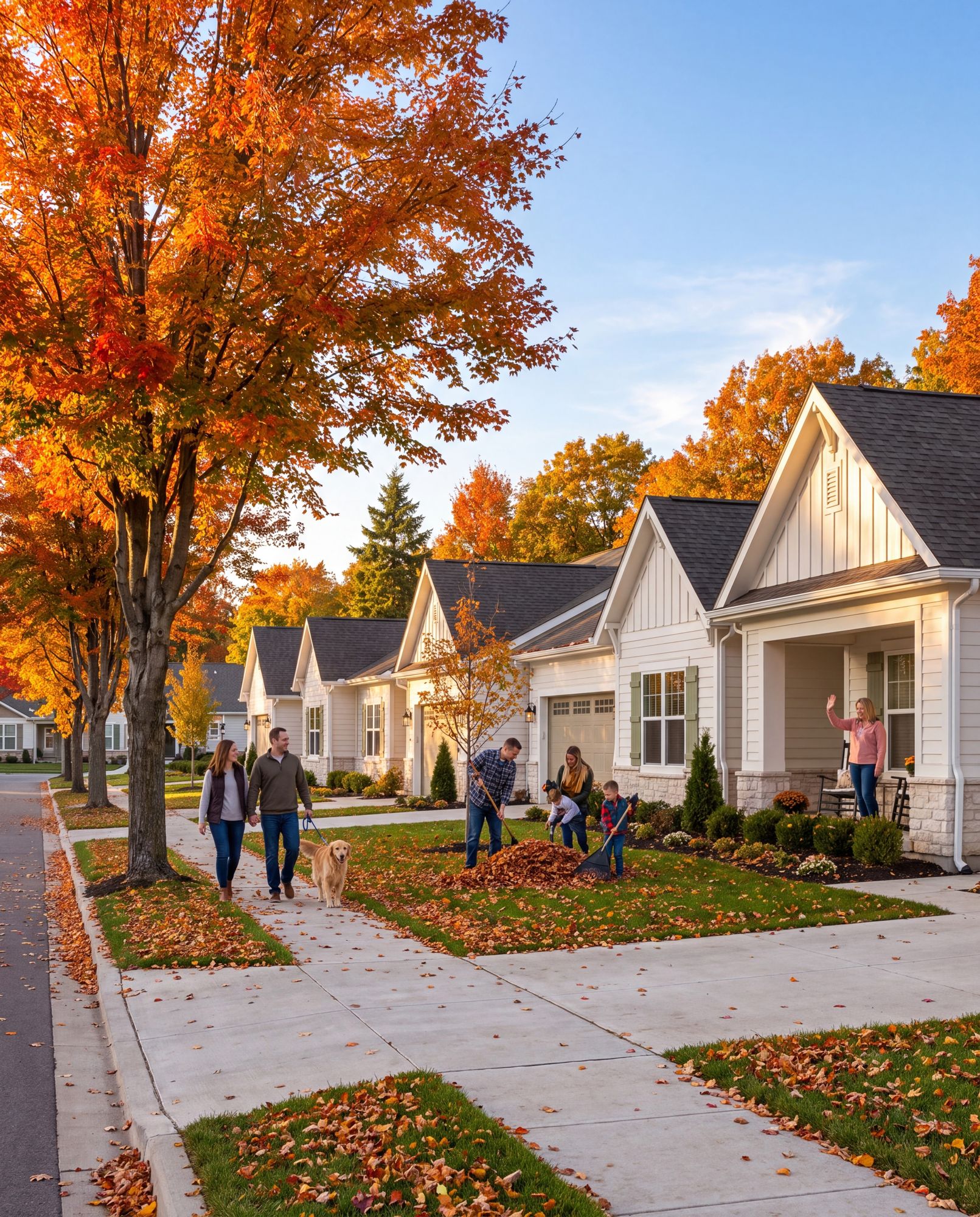
Homes built to last, with real materials and the estate’s salvaged stone. Built right, so they appreciate.
Stay Well · Living Heritage: a home in a place with a past.
The Move-Up Family’s better life; the Rooted Downsizer staying near family.
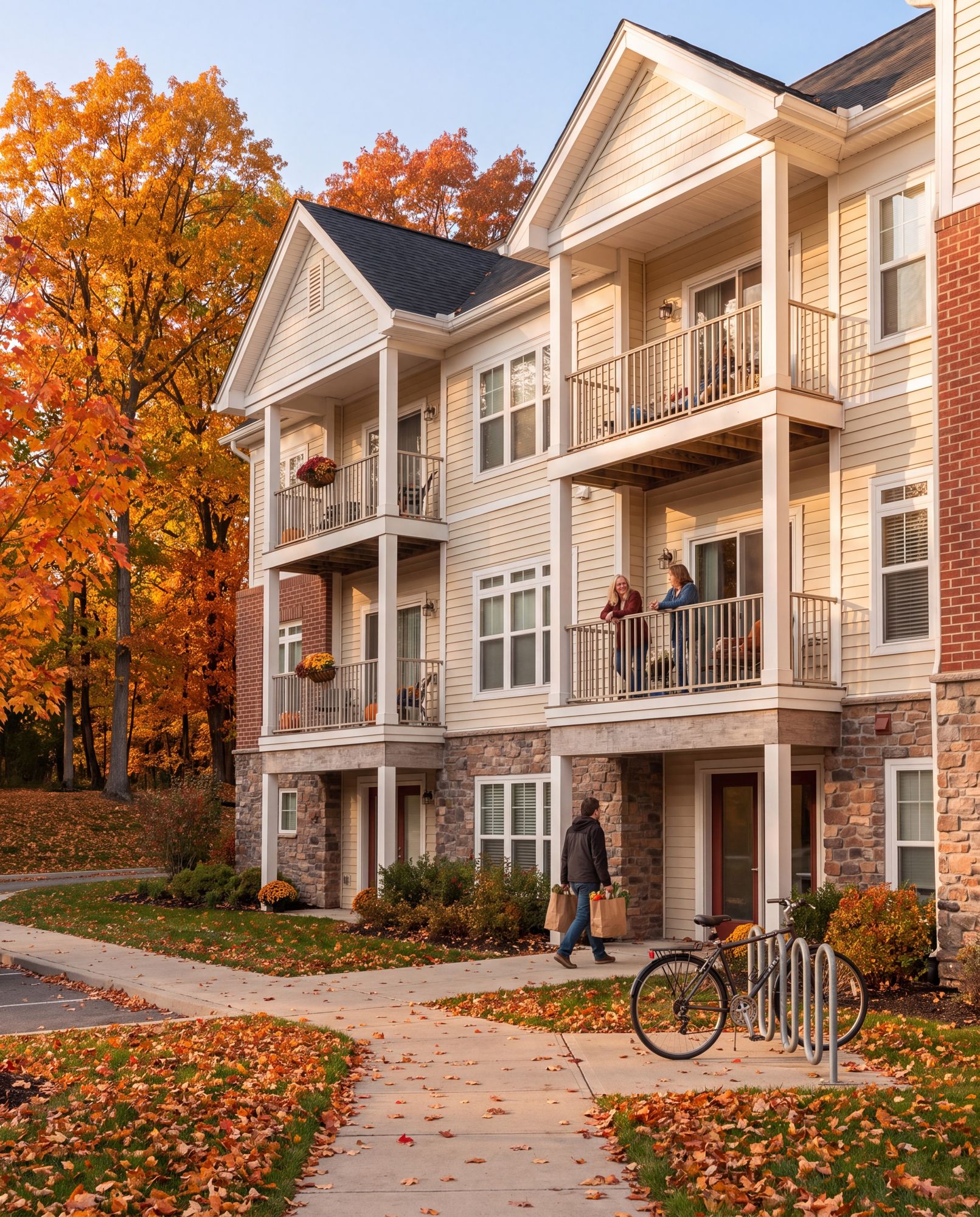
Modern apartments: the simplest way to live at Bolton, and the easiest way in.
Stay Well · Quality of Life: the same neighborhood, for renters.
A Young Nester’s first place at Bolton, no deed required.
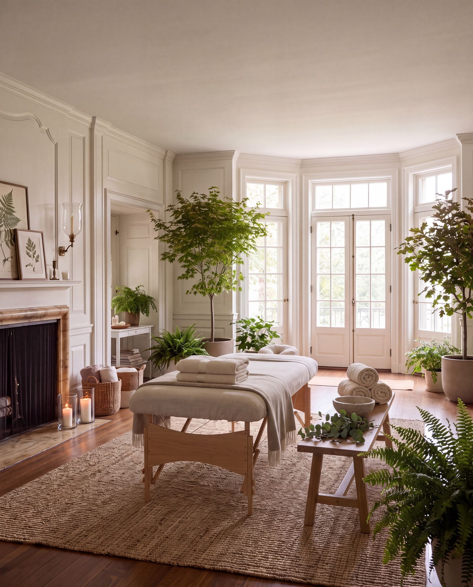
The spa, the studio and the practitioner, on the Manor’s lower floor, inside the hundred-year house.
Quality of Life: body and mind, tended inside the house itself.
The 7 a.m. class, the standing appointment, the sauna in January. Ease, made routine.
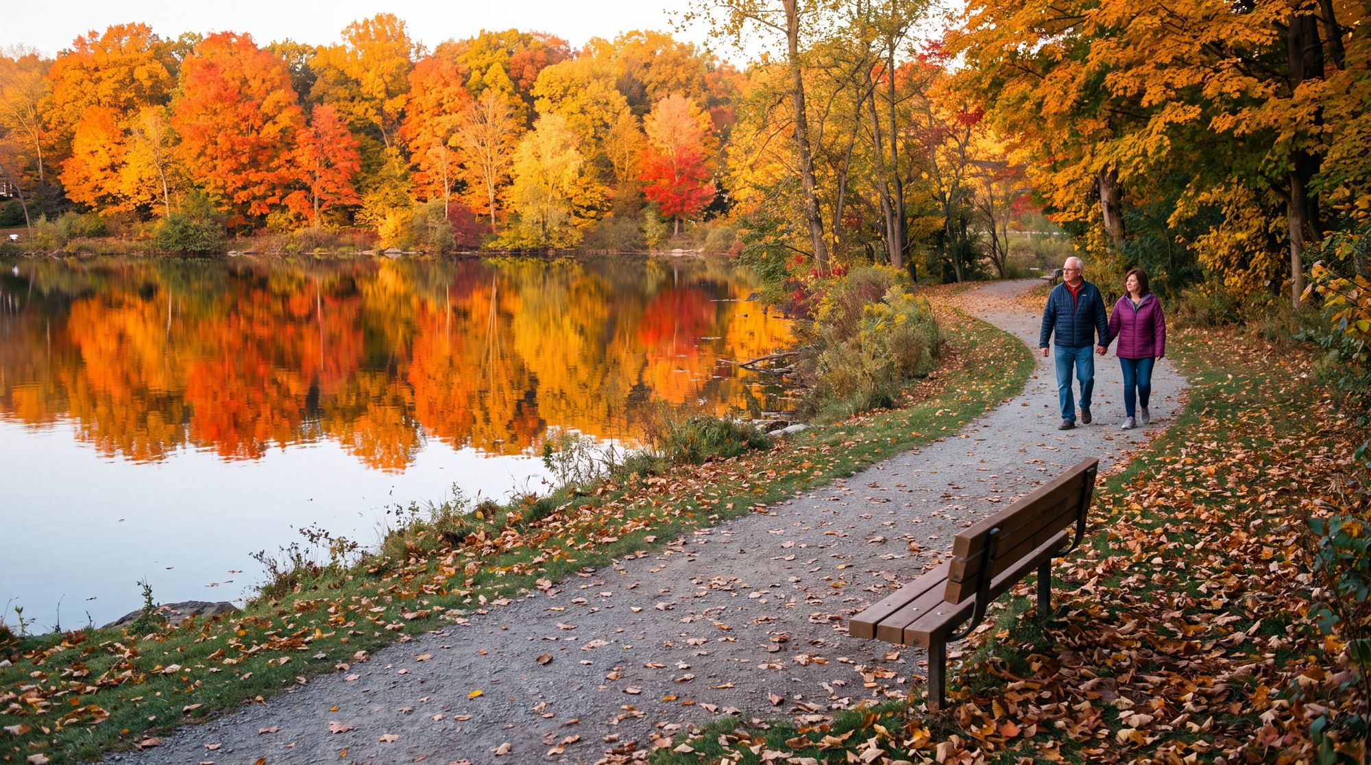
The still water at the center of the plan, with a path all the way around.
Feel Well: stillness, reflection, the water at rest.
A bench at dusk, a slow loop on the path, the quietest hour of the day.
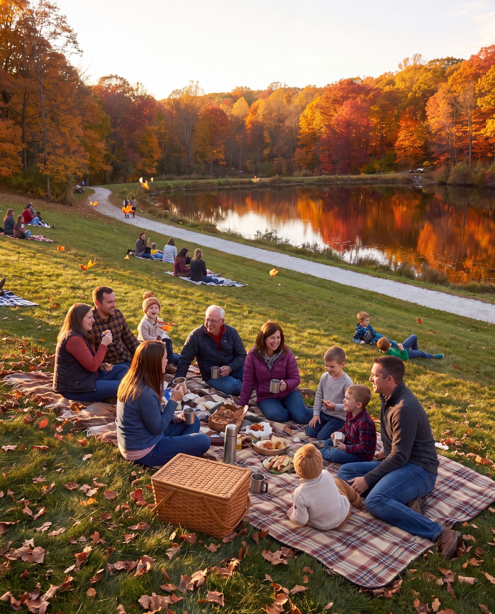
The overlook above the lake: open lawn for picnics, the view and the long light.
Play Well: unscheduled time, the oldest amenity there is.
A kite, a picnic, the Fourth of July. The hill is the estate’s front porch.
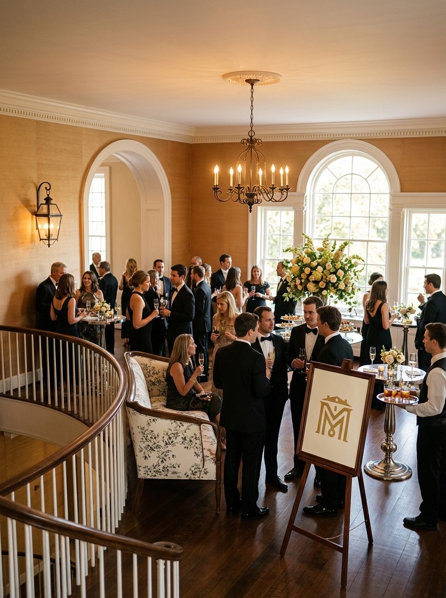
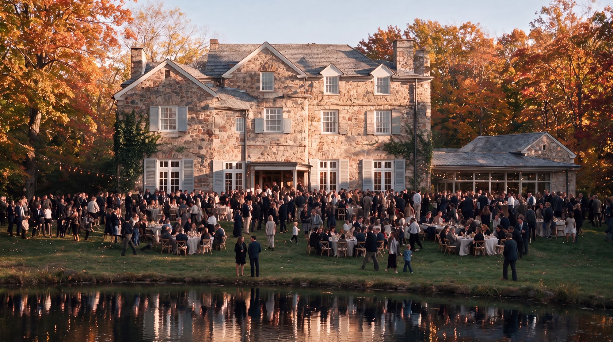
The Manor’s great room and event spaces, for ceremonies and the estate’s formal occasions. A three-story fieldstone house, restored, with a terrace above the ponds for weddings, gatherings and community events.
Gather Well · Living Heritage: the house, hosting.
A wedding, a hundred guests, and every one of them leaves knowing Bolton.
Streets, buildings, rooms and venues follow the same rules: every name comes from the place and clears five gates. The first ten street names are the examples.
Written on an envelope on first hearing, without asking how.
It carries an image or a hook, not just a pretty sound.
A name no nearby street already uses.
No surnames. Names come from the land, never a family.
Checked against Mentor’s existing streets and names.
The working vocabulary of an old manor’s grounds: gates, hedges, the dovecote, the mill. Grounded, and instantly readable.
Woodland and landform, straight from the preserve and the trails. Sensory and seasonal.
English and Irish place-names, naturalized on an American sign. They sound old and carry weight, and none is a surname.
Flagstone Drive · Hollyhedge Lane · Dovecote Court · Mosslight Trail · Willowmere Drive · Foxglen Court · Oakmere Drive · Malvern Drive · Alderley Avenue · Painswick Lane
The logos, the colors, the type and the photography, and the rules for using them.
The B, the BOLTON wordmark and the LIVE WELL line, stacked. Bolton at its most complete.
One color, on a clear ground. Never rebuild it: place it from the master file.
Covers, the sales gallery, the entrance monument, the first page of anything.
1.5 in wide in print, 140 px on screen. Below that, use the B alone.
The B on its own: the smallest, most flexible form of the logo, and the part people recognize at a glance.
One color. It must survive plain black and plain white: a stamp, an embroidery, a favicon.
Merch, the favicon, the social avatar, the app icon. Wherever space is tight, the B carries the brand.
0.25 in wide in print, 24 px on screen, 1 in for embroidery.
The name BOLTON drawn as a mark. Always placed from the master file, never typed in a font. Uppercase only.
One color. Use it where the B already lives nearby, or where a full mark would be too much.
Running headers, document titles, the spine of a book: anywhere the name carries on its own.
0.75 in wide in print, 72 px on screen.
Three more versions of the logo, for layouts where the stacked logo will not fit. Same rules: one color, clear space, from the master file.

The B beside the wordmark, split by a rule. For wide signs and letterhead.

The B drawn into the wordmark. For business cards, email and small print.
The stacked logo with MENTOR · OHIO. For civic material and press.
For formal and hand-finished pieces. One color only.

The B inside the estate shield. Built for weight: seals, gates, certificates.

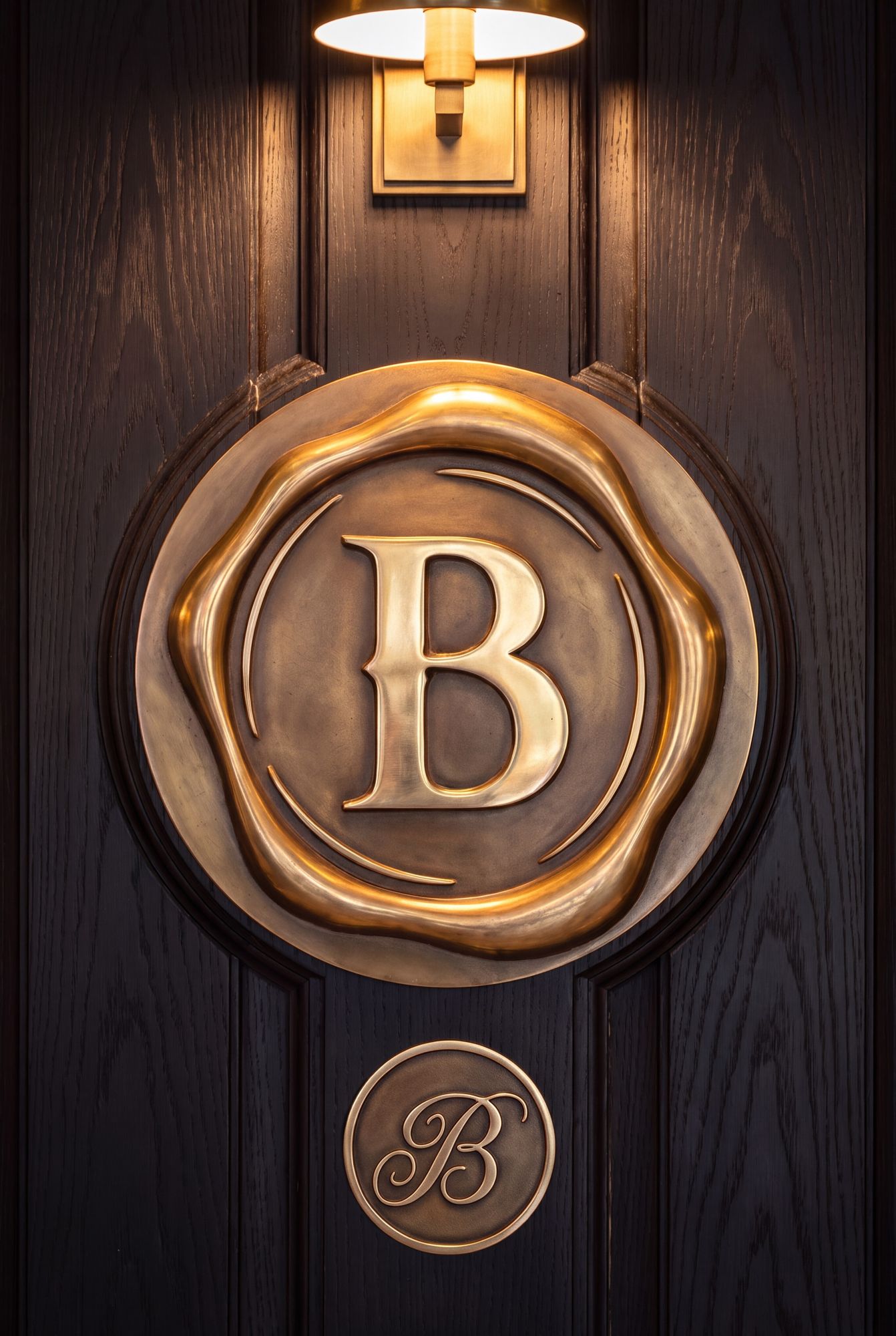
The stamped B. A maker’s mark for pressed, printed and hand-finished pieces.
The Ripple, the mark for Live Well. A secondary mark.
One act of living well spreads to the people around it, the way a ripple spreads across still water.
A watermark on paper, a stamp on packaging, a sculpture at the center of the place. Never as a logo, never next to the B, never with a word inside it.
1 in across in print, 96 px on screen.
Every mark gets at least the height of the B free on every side. No type, no other mark and no page edge comes inside that space. The dashed line shows that space.
What to do and what to avoid every time you place a logo.
One color at a time. Dark on light, light on dark. Every mark must also work in plain black and plain white.



The palette, its tints, and the color sets for every piece.
Moss and Honey are the two primary colors and lead every piece. Six supporting colors are used deliberately, each at its exact value.
The green. Grounds, body copy, and the default mark.
The warm accent. Highlights, folios, and fine detail.
Each color comes in five steps. The middle step, outlined, is the color itself: use it for every field, every word and every logo. The lighter and darker steps are for gradients and depth only, never a substitute.
Gradients belong on covers, backgrounds and dividers, never behind body text.
In every piece, one color covers about 60%, one about 30%, and one accent about 10%. The four ready-made sets cover most work, and the contrast rules keep text readable.
The palette never changes; the lead set does. The Field for spring and summer, Forest & Water for fall, The Plaque for winter and the holidays. A season is a choice of set, never a new color.
Dark on light, light on dark, one color at a time. Never set Sage as text on Moss.
The typefaces and the rules for setting them.
Each typeface has one job. Use one serif plus Inter in any piece. Montserrat Bold is only for the LIVE WELL line.
Headlines, the wordmark, sub-brand names. Warm, old-style, high contrast.
Stone, crests, monuments, names in stone. Ceremony only, never body copy.
Long-form reading and formal body: the register for rules, letters, and quotes.
Body copy, captions, wayfinding, interface. Plain, legible, modern: the everyday hand.
If a sixth size seems necessary, the layout is wrong. Start from the body: the smallest text anyone has to read, at the distance they read it. Every other size steps up from there.
We speak, we don’t shout. Caps are for labels only.
Never mix two serifs in a lockup.
Long enough to flow, short enough to track. Left-aligned, ragged right.
Body sits at 1.55–1.6. The page breathes.
For a hundred years, the people who built Cleveland came here to live well. The specific carries the weight: hundred-year-old trees, a creek, a stone house.
One art direction for every picture and every frame of film.
How Bolton’s pictures and video should look: real places, real light, warm color, people at ease. Film follows the same rules.
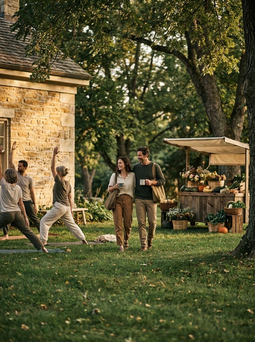
An image is worth a thousand words. Get it right, and the photograph does the inviting. No photograph of Bolton exists yet: the pictures here show the style, and each is replaced as real photography comes in.
Six frames that show the style, as a magazine would shoot the places at Bolton. Use them as the reference for every new shoot.

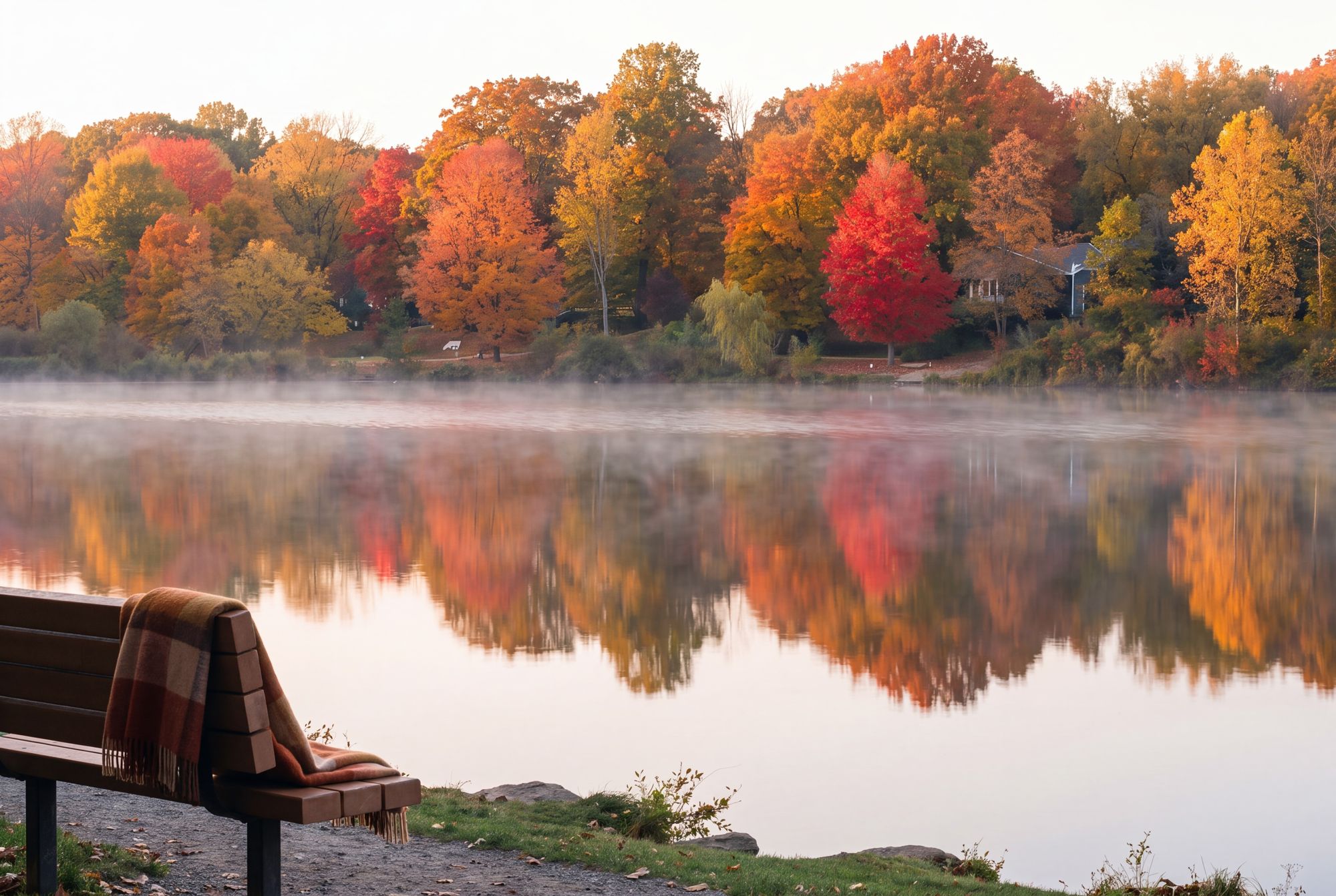

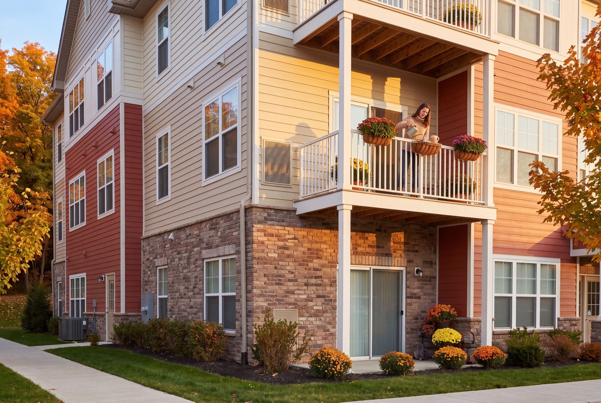
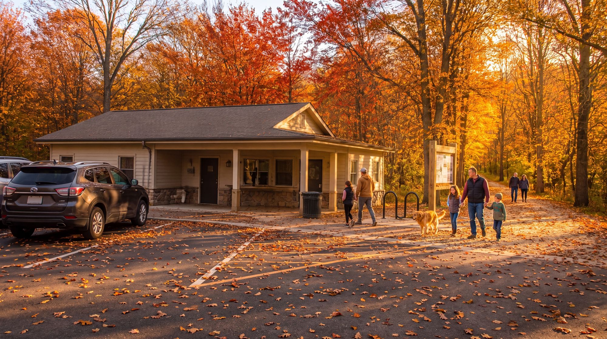
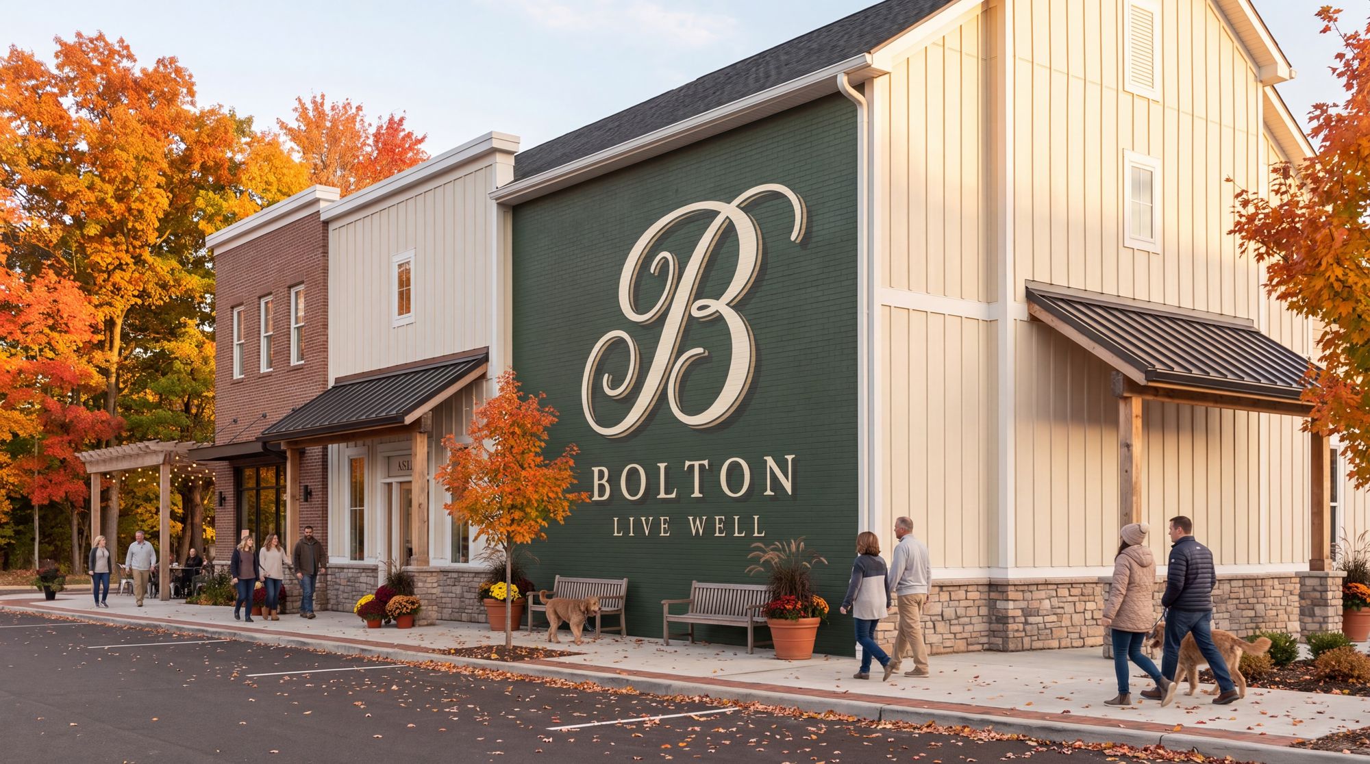
The brand worn, sent, posted and built: every piece made to the same rules.
The mark in one color, embroidered or printed flat.
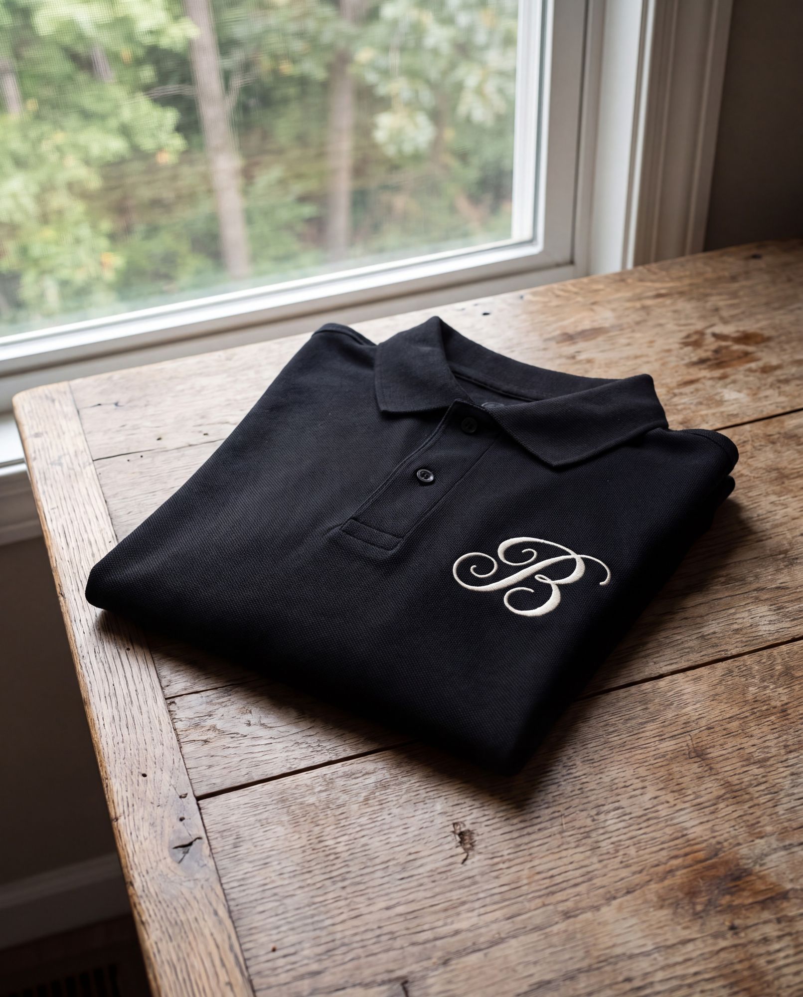
Black, the B embroidered in Bone thread.

The B alone, one thread color.
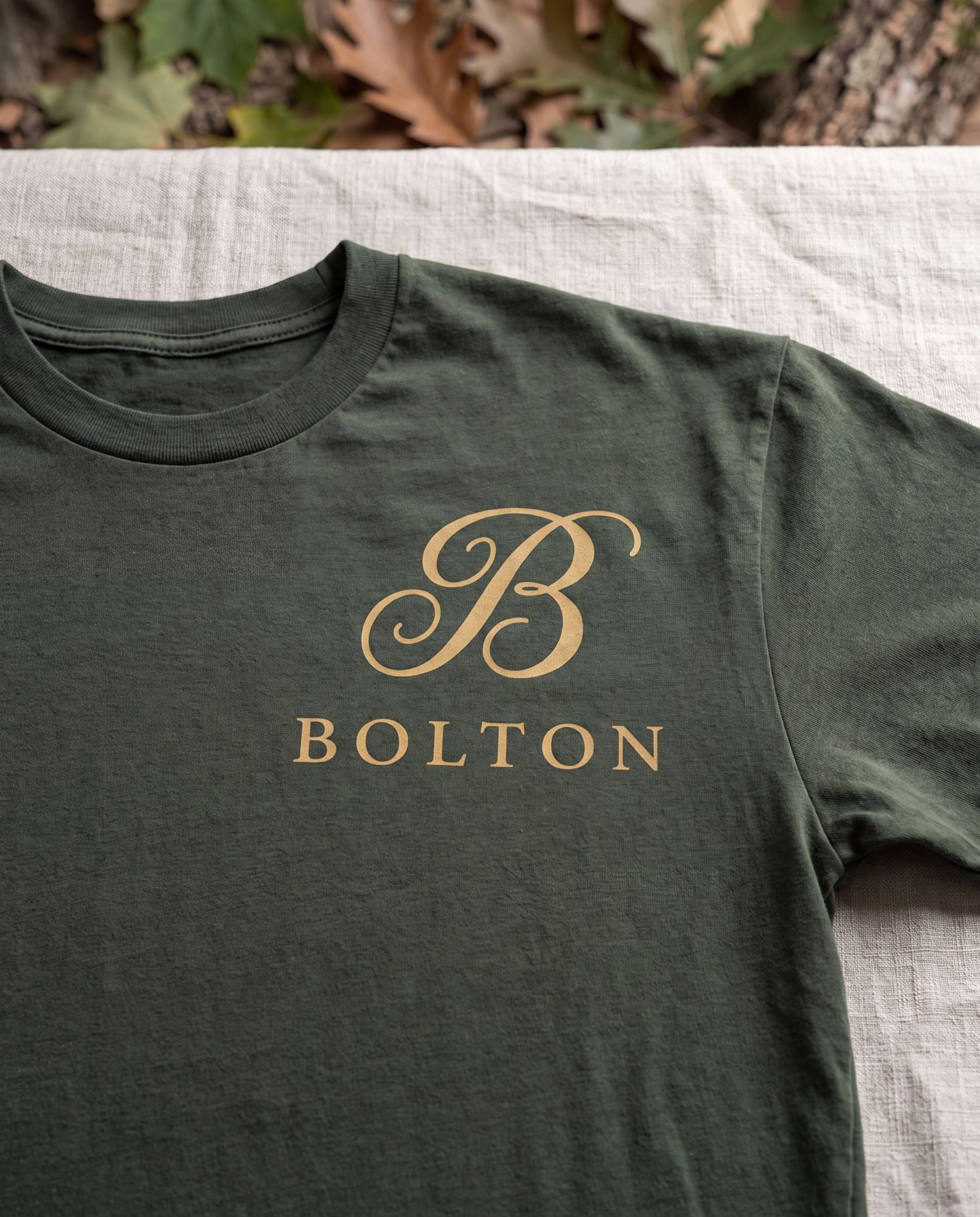
Moss, the B and BOLTON printed in Honey.
Letter size. The combined logo top left, a Honey rule, the letter in EB Garamond, the details in Inter.
Bone or white paper, dark type, a Honey accent.
EB Garamond at a reading size, left aligned, generous margins.
Inter, small capitals for the footer; the address and site on every sheet.
 LIVE WELL
3.5 × 2 in. The front carries the person; the back carries the brand.
Bone. The combined logo, the name in Fraunces, the title in Inter capitals, the details in Inter.
Moss, with the primary lockup in Bone, centered, nothing else.
A heavy uncoated stock; the back may be printed or foil-stamped in Bone.
LIVE WELLA #10 envelope, 9.5 × 4.125 in. The front stays quiet; the back is sealed.
Bone. The combined logo and the return address top left, the recipient in EB Garamond.
The seal, in Moss, pressed where the flap closes: wax for invitations, a printed seal for everyday mail.
The logo in one color: Moss on Bone.

The profile mark and how to plan the grid. People judge an account by its first nine posts, so plan them as one picture.
The B with Live Well set straight beneath it. It reads at any size and drops cleanly into a circle, square, or rounded square.
Read the top nine as one composition. Alternate land, life, and heritage, repost real resident life with credit, and keep every frame on the palette.








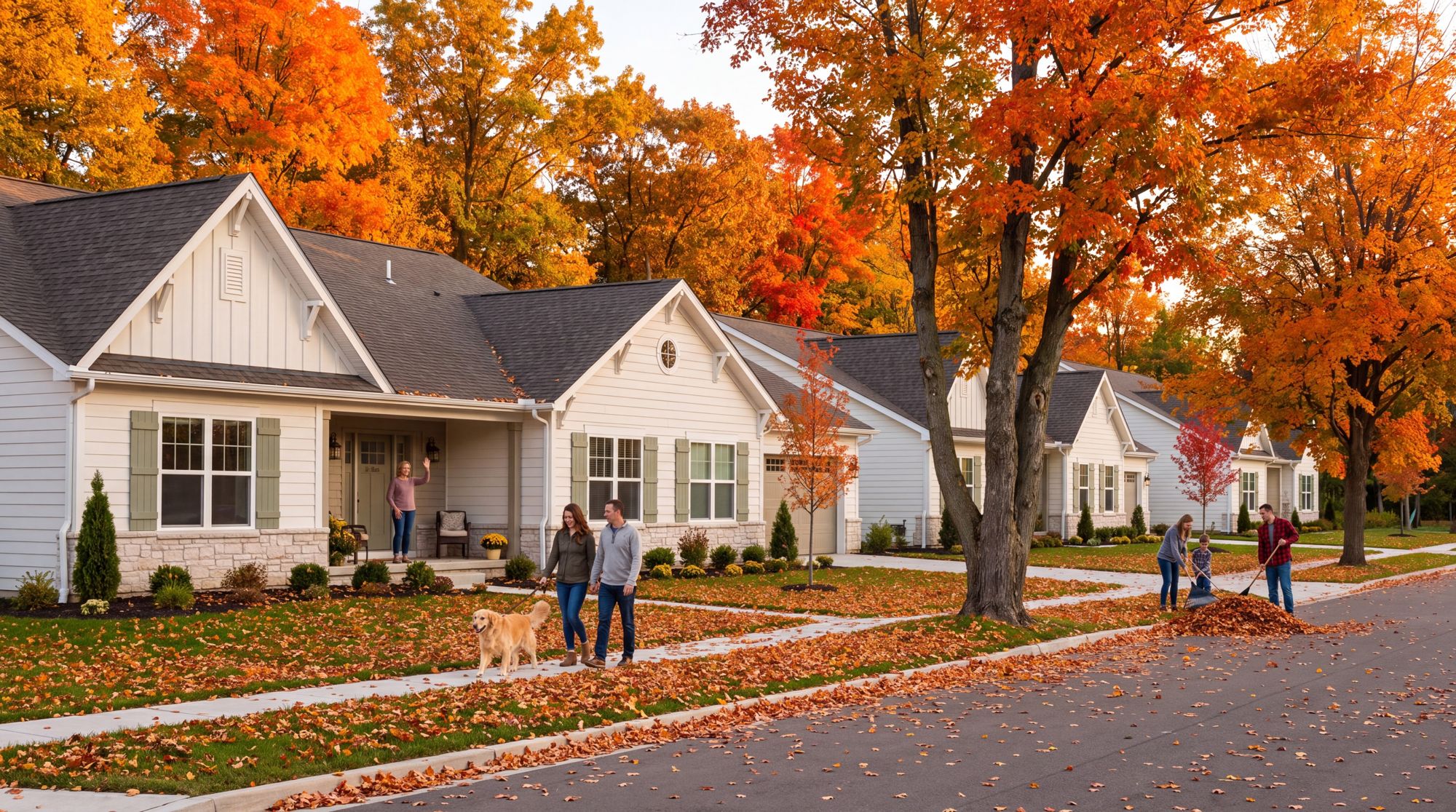
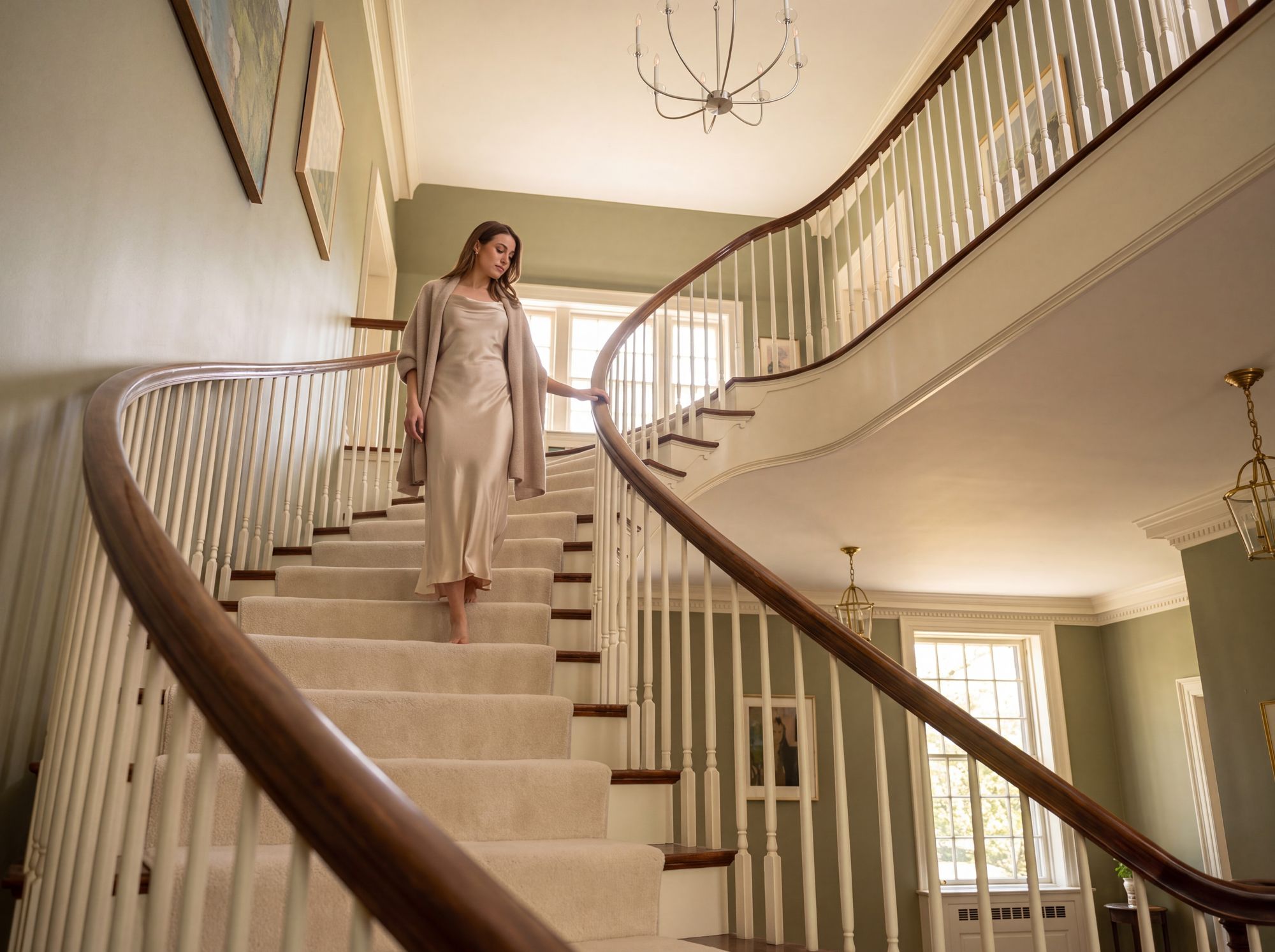

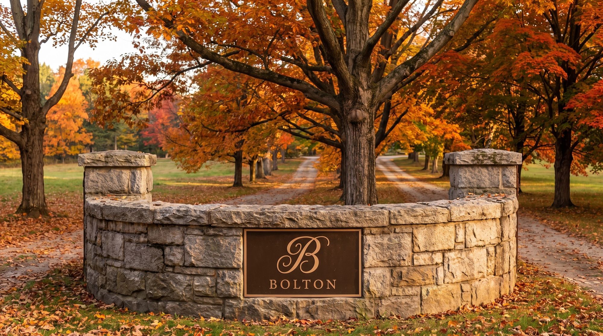
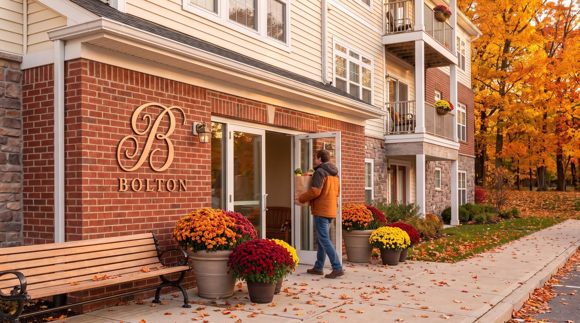
The logo out in the world: the entrance, the buildings, the paths and the streets.
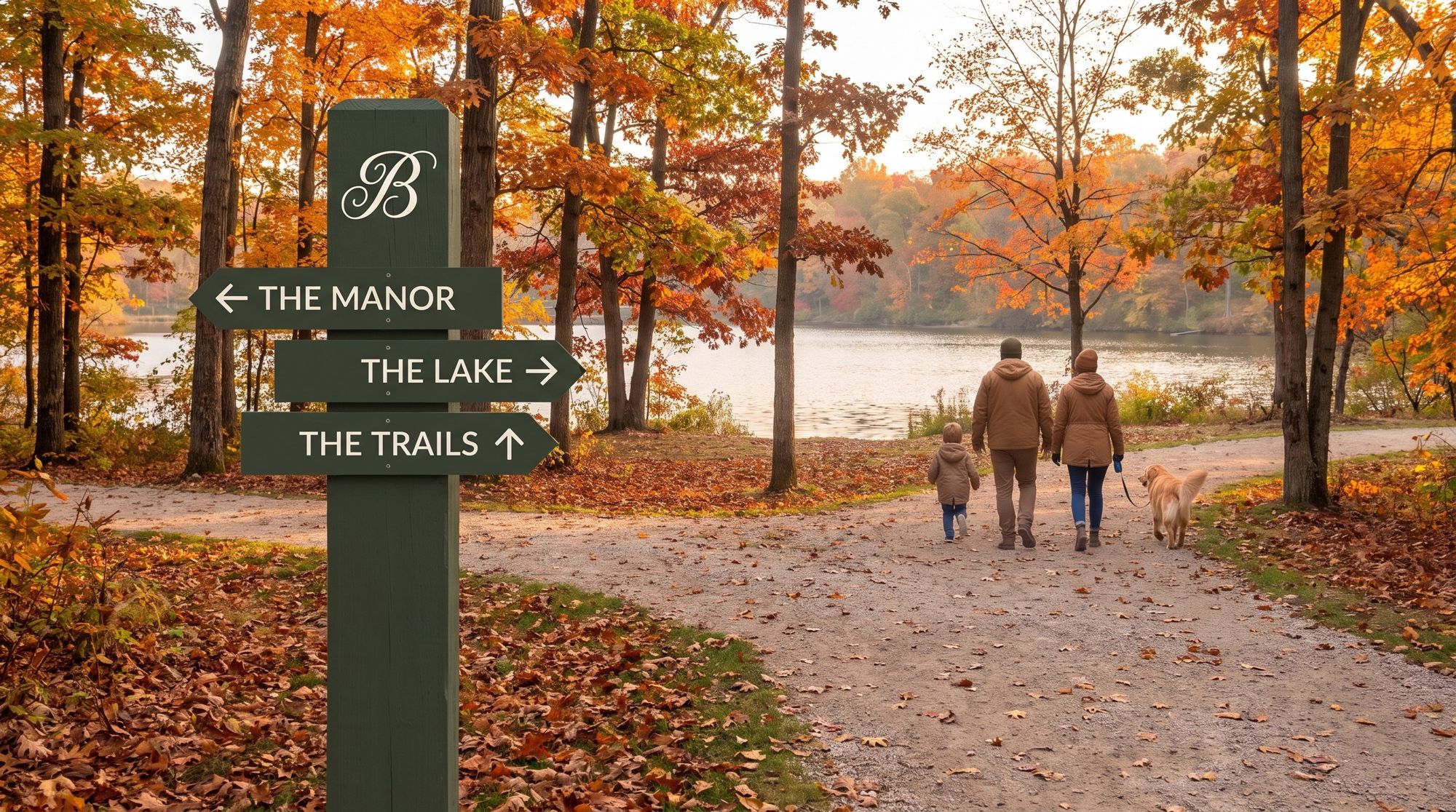
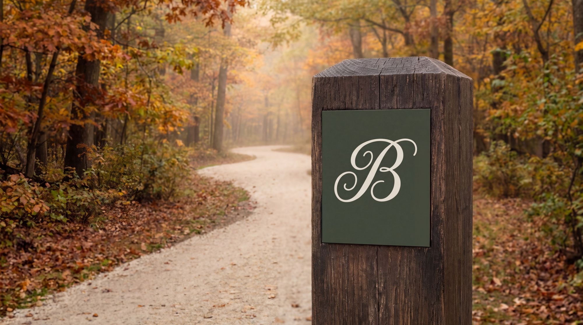
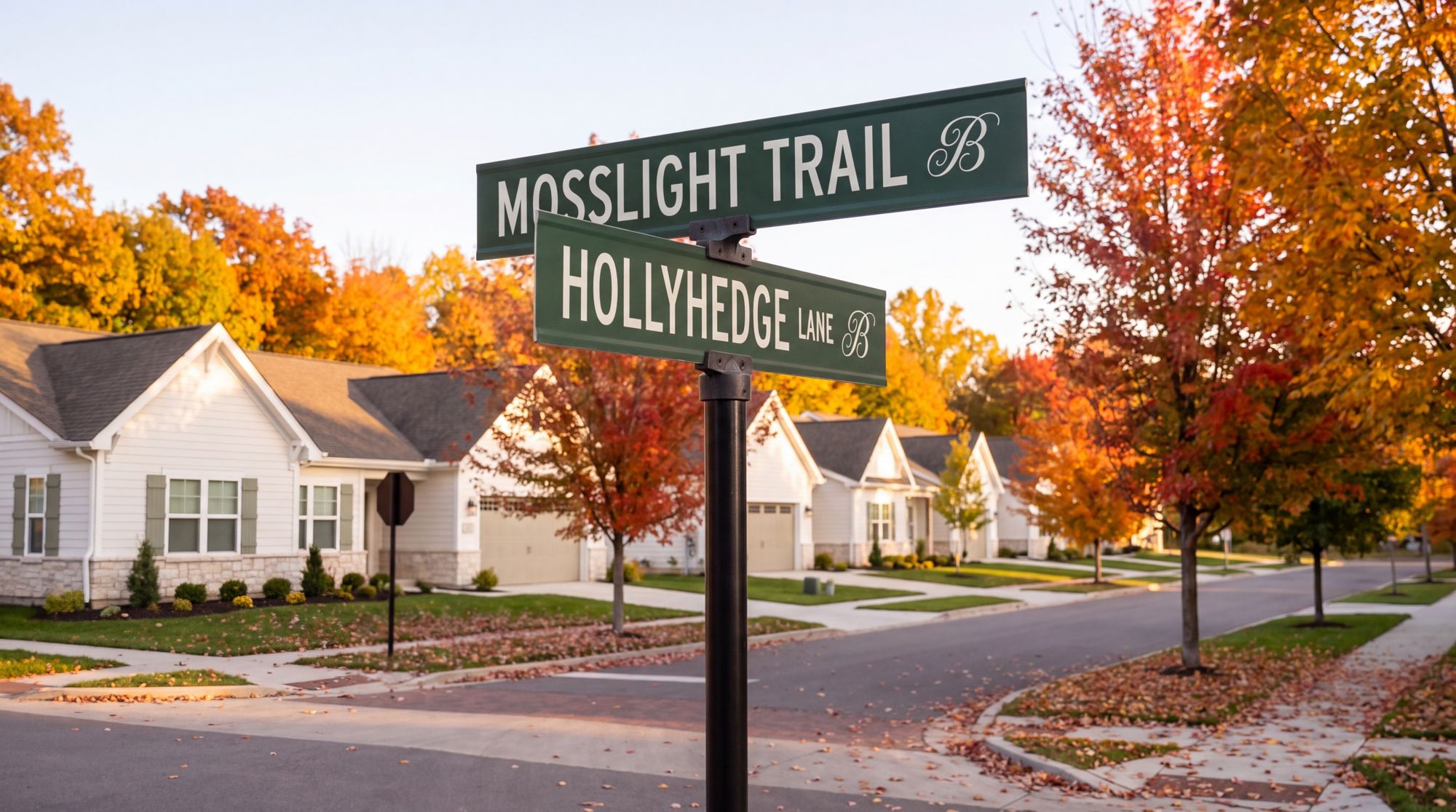
Each mark in one color on paper, ceramic, fabric and metal.
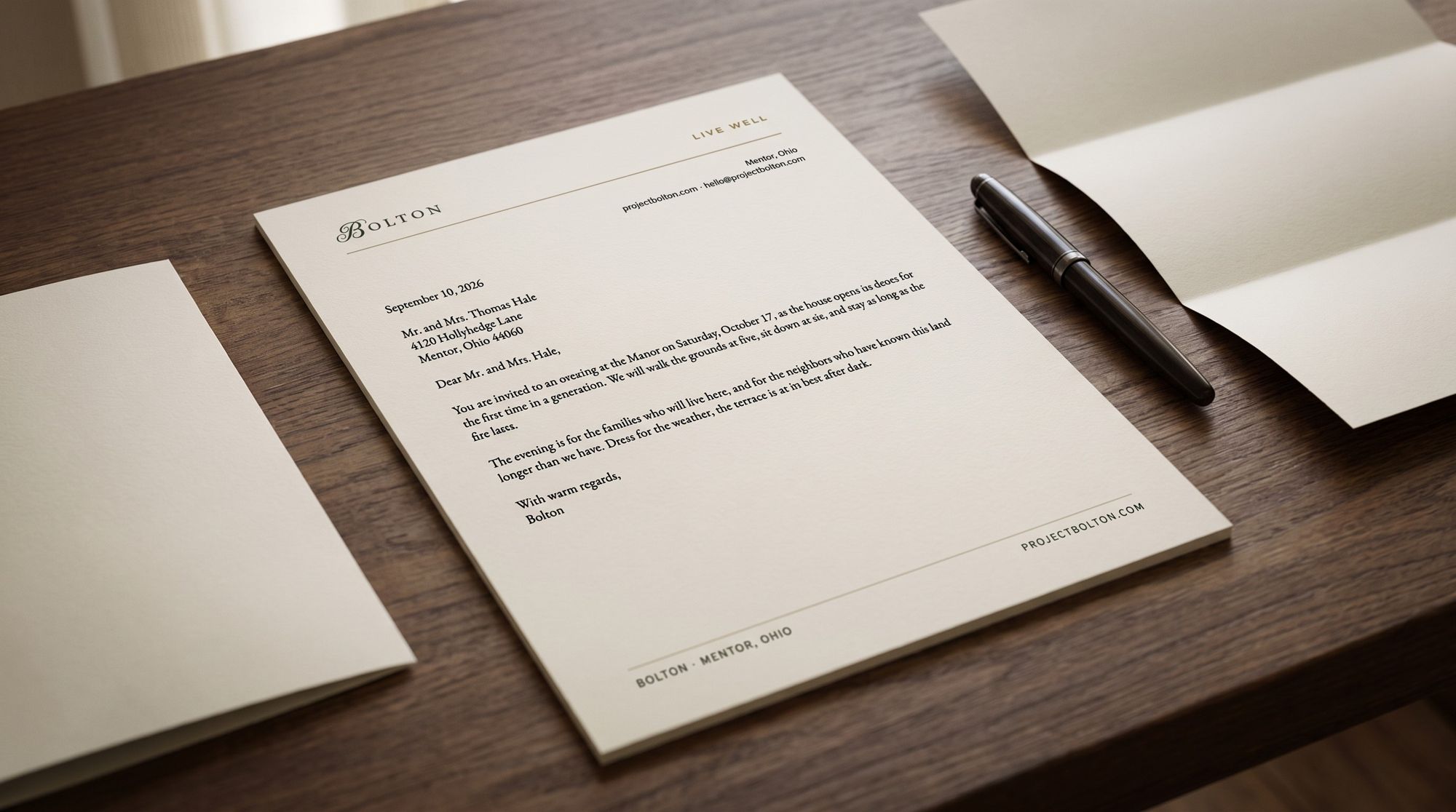
The combined logo on Bone paper.
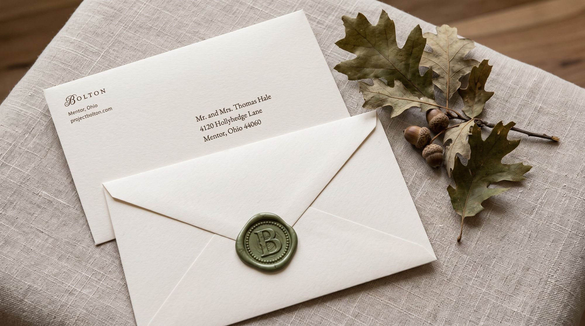
The seal pressed in Moss wax.
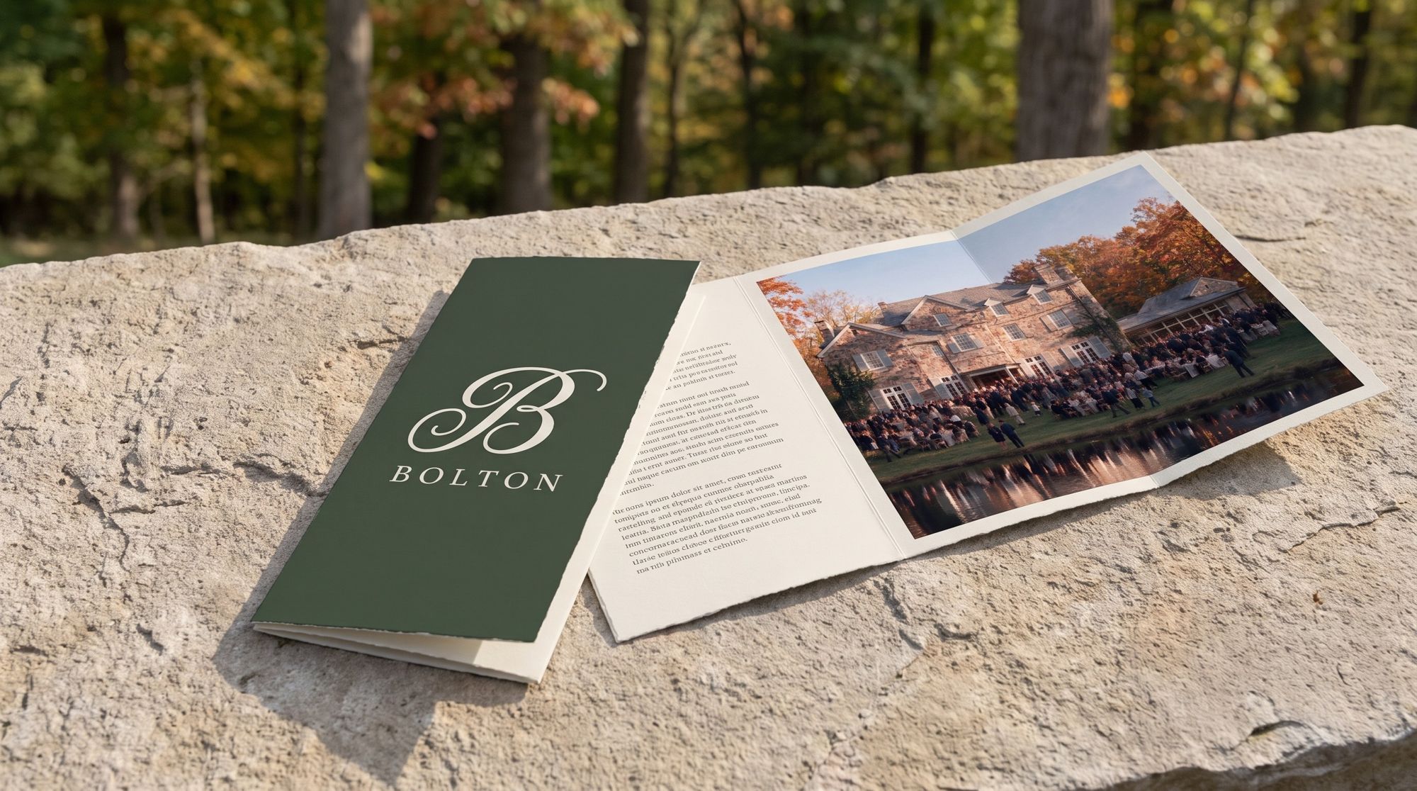
The primary logo in Bone on Moss.

The B and the wordmark, one color each.
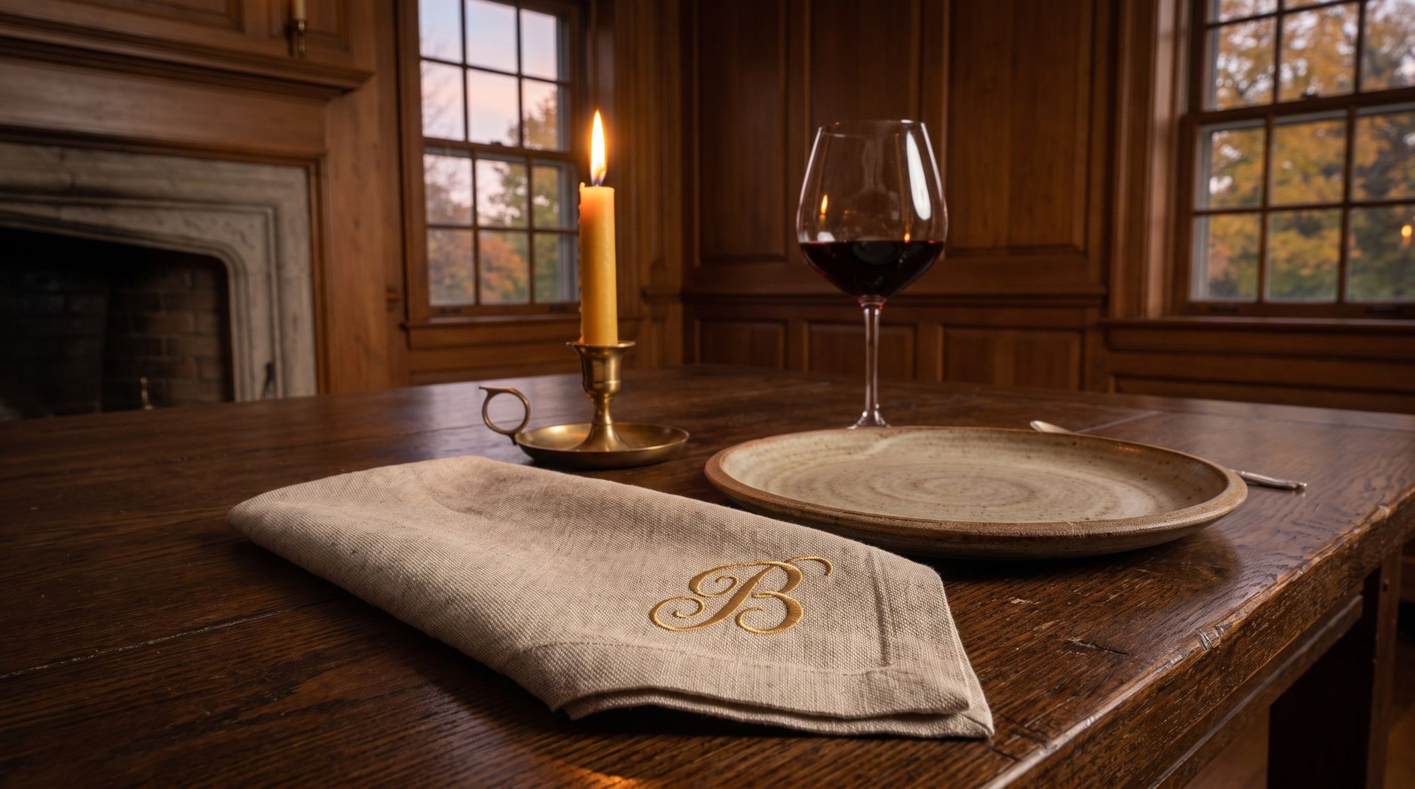
The B embroidered in Honey thread.
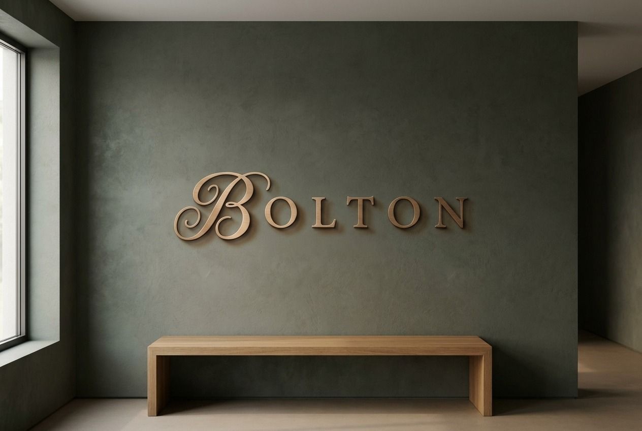
The wordmark in metal.
A hundred years ago, this was a place people came to live well. Restored, it is that again. The brand keeps its value only if every piece follows this book.
Held by the development’s ownership, stewarded day to day through Spark. One custodian, one voice.
Anything carrying the B clears one review through Spark before it goes public.
The cover carries the current version; work only from the latest file. New work starts from this foundation.
The B, the wordmark, the lockups, and Live Well reproduce only from the master files, only as shown.